
One of the top reasons why restaurants lose guests is not bad food, but an environment that doesn’t match their expectations. When a plate feels lighter than it should, or the glassware doesn’t balance right, and when the flatware looks cloudy, it all points towards neglect, inconsistency, and a lack of attention to detail.
When anything about the tableware feels off, the guests form an idea about the food and the brand. Learning how to match dinnerware and flatware is not just a style choice anymore for restaurant tabletop design. It is perception control.
According to Charles Spence and his team at the Crossmodal Research Laboratory, diners experience food in context. According to another study by Harrar and Spence, the weight, size, and shape of dinnerware directly influence the way food tastes. For instance, a heavy fork can make a dish feel premium and satisfying compared to a lighter or crooked one.
So, how to match dinnerware and flatware? In this guide, we will talk about tableware coordination in a restaurant and matching dinnerware, flatware, and glassware to elevate the diners’ experience with your concept.
Start With Your Restaurant Concept (Not the Catalog)
Most restaurant operators flip through a supplier’s catalogue to find the design they like, and then, upon procurement, build the entire table around it. But this is how you’d actually end up with a table that looks nice but feels disconnected from your concept or menu.
To match dinnerware, flatware, and glassware, you need to start with your concept. Think about the kind of dining experience you wish to create. Everything about the dinnerware, including the material, finish, and color, should be part of your procurement strategy.
As per Pantone Color Institute, color selection and placement can directly influence the way people perceive the atmosphere and set expectations about it. And that’s even before the actual interaction begins.
Putting thought into dinnerware is so important that it can make your customers come back with their friends and families in the future, or have them regret dropping by.
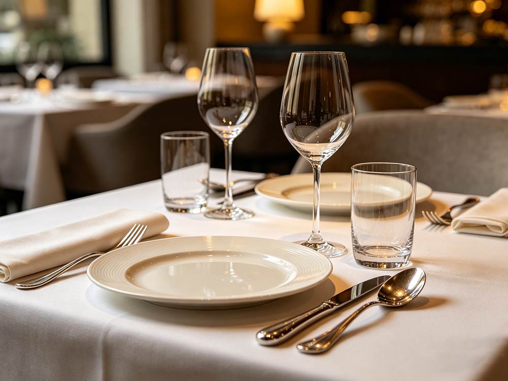
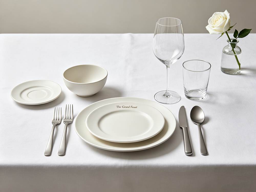
Fine Dining / Tasting Menu
Fine dining is all about precision. It’s about creating a visual story while balancing control and clarity. Bone China Dinnerware and High-end Porcelain Dinnerware are usually the top choices for these concepts.
The crystal stem in the glassware category takes the lead as it looks appealing and sophisticated, and goes with the plates and concept. Take a look at Brett’s Custom Luxury Crystal Wine Glass Set in this category.
Since bone china has a thin profile and appears translucent, it serves as a neutral canvas for food. Forged and high-polished 18/0 stainless steel flatware complements it best and can make the whole tableware come together. Learn more about the flatware grades in the guide: Stainless Steel Flatware Grades Explained: 18/10 vs 18/0.
Upscale Casual / Modern Bistro
Modern bistro tableware should be aesthetic, presentable, and operationally efficient. It must be able to perform under pressure and retain its luster and looks even after frequent use and dishwashing.
Commercial-grade porcelain works best for this segment, as it’s durable, resistant to chipping and heat, and is also easy to maintain. The neutral finish also supports the versatile plating styles suiting unique menus and seasonal presentation requirements.
Coupe-style plates with a rimless, low-profile form are a popular choice here. These have a comparatively large plate surface that offers a wide visual frame for food. It also aligns with the minimalist presentation style associated with modern bistro dining.
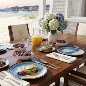
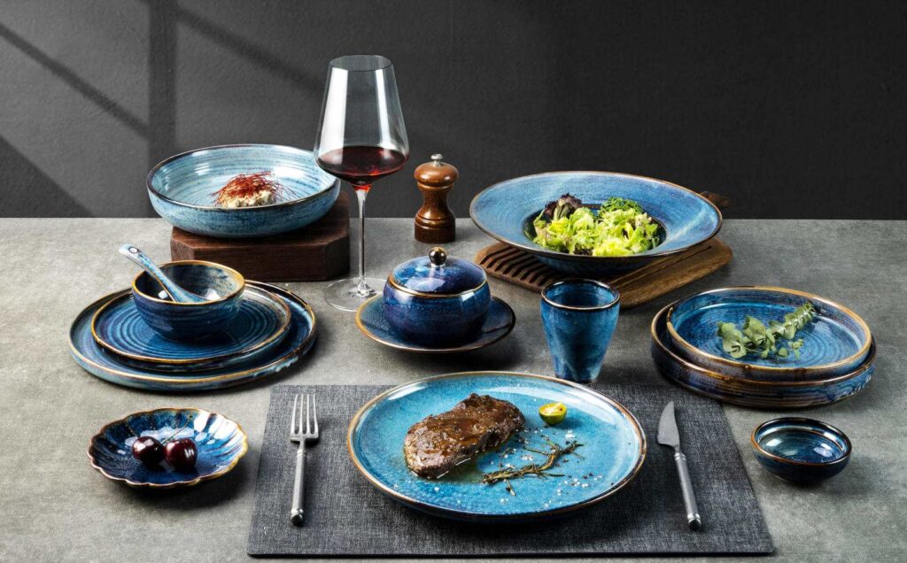
Rustic / Farm-to-Table
Most farm-to-table concepts exude warmth and authenticity. The dinnerware that highly aligns with the concept is textured stoneware, such as Brett’s Japanese Hand-Thrown Ribbed Stoneware Dinnerware and reactive glaze finishes. Glaze creates variation and a slight imperfection in the serving style. When no two plates look identical, the serving looks unique, kind of handcrafted.
Learn more in our guide: Understanding Reactive Glaze Dinnerware: Design, Safety, and Care Guide.
Matte flatware works best with these dishes as it doesn’t visually clash with them. In glassware, thick-walled tumblers are the preferred choice. Explore more about Wine Glasses for Restaurants here.
Fast-Casual / High-Volume
For fast-casual and high-volume settings, we need efficient and durable dinnerware. The priority switches from aesthetics to operational efficiency. Hence, fully verified porcelain that is cheap, resistant to staining and water absorption, and stackable works best for the setting.
In flatware, 18/0 stainless steel is magnetic, cost-efficient, and complements the dinnerware.
Flatware Dinnerware Pairing: How to Match Dinnerware and Flatware Textures and Finishes
Most tabletop designs click and work in harmony, or feel subtly or entirely off. You need to match like with like. That means the finish, texture, and often colors too must complement each other once placed together on the table.
- Smooth and Reflective: Glossy porcelain or bone china is used in formal settings. In such concepts, usually procurement managers opt for 18/10 flatware with a mirror finish. Just as the dinnerware, the flatware too reflects light, and both of these go with the clean and refined crystal or thin-walled glassware.
- Textured and Matte: If you are serving on stoneware dinnerware with reactive glaze, satin and matte finishes both work with it. The tableware here must absorb light to give a grounded and approachable feel to the restaurant. Amongst glassware, thick-walled and handblown styles work best.
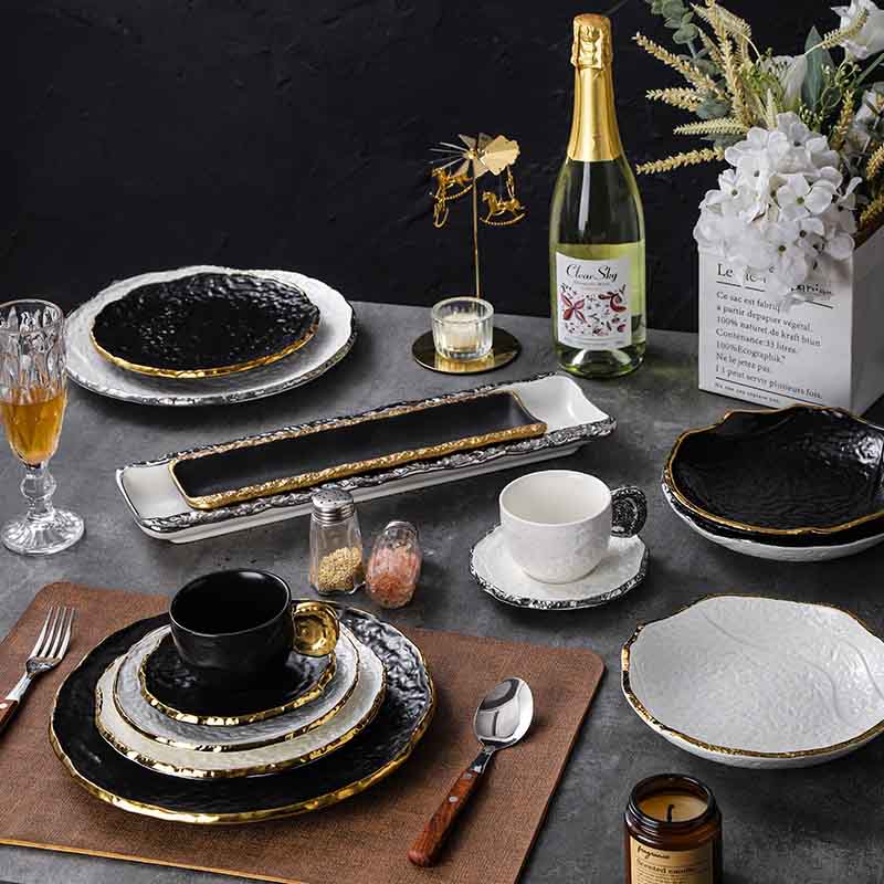
- Contrast:Mixing and creating contrast across the textured groups, like mixing matte stoneware and polished flatware, too, can work only if intentionally done. The concept creates a contrast and visual interest between the elements on the table. However, when wrongly executed, it feels like a mismatch.
For example, when Brett’s Matte Black Stoneware Dinnerware Set is paired with polished 18/10 stainless steel flatware, it creates a strong visual contrast between soft, non-reflective surfaces and high-shine finishes.
Why Weight Coordination Matters More Than You Think
Unfortunately, weight is one factor that doesn’t get as much attention as it deserves in the procurement decision for dinnerware and flatware. But, truth is, where texture gets you the attention, guests feel the weight too.
In a premium setting, a heavy fork will feel luxurious, whereas in a casual café, it’s just excessive. Flatware can be considered in three categories: forged, heavy, and medium-weight.
Forged flatware is the heaviest and so best suits fine dining and tasting menus. Heavy-weight flatware can be assigned to upscale casual and modern bistros, while medium-weight designs are best for fast-casual and high-volume service. Explore more in the guide: Commercial Flatware Selection Guide: Materials, Weights and Durability for Restaurants.
This way, the weights match those of the dinnerware in each particular setting as well. Such as porcelain and bone china, which are mostly the standard for premium dining, work well when paired with forged flatware. Learn more about the materials in our guide: Bone China vs. Porcelain Dinnerware: Which Should Hotels Choose?
The goal is not to “match weight” exactly, but to maintain a consistent tactile and visual language on the table.
The same principle applies to glassware. Material and weight influence both durability and perceived quality. For everyday high-volume service, tempered glass is widely used as it is more resistant to breakage and thermal shocks.
In contrast, premium settings favor crystal or high-clarity glassware, which is thinner, lighter, and feels more refined in the hand. This enhances the drinking experience and overall perception of the beverage. Read on more about Commercial Glassware Selection: Durability, Styles, and Pairing with Dinnerware.
Color and Finish Coordination
Color isn’t just about decoration; it reshapes guests’ perception. It is the place where decisions begin to influence how food is experienced, not just how it looks.
White Vs Colored
According to research published in Food Quality and Preference, plate color can strongly influence the taste perception, with food rated as sweeter and more enjoyable when served on white plates compared to black ones.
The fine dining industry overwhelmingly uses white porcelain and bone china. It’s not just about a “clean canvas” anymore. It’s about amplifying the flavor and contrast. White makes colors pop, and portions feel more defined.
Read more about color psychology here: White vs. Colored Dinnerware: Psychology and Plating Design for Restaurants.
Color-Taste Associations
As per another research by Charles Spence and collaborators, people associate specific colors with taste. For example, red and pink are associated with sweetness, yellow with sourness, white and blue with saltiness, and darker tones like black with bitterness.
These are crossmodal correspondences, and they happen automatically in the brain. Your plate color can actually affect the way a dish is perceived before even the first bite.
Like, a dessert placed on a dark plate may feel rich and intense. The same dessert on white one can feel lighter and more balanced.
Warm vs Cool Tones
Color psychology doesn’t stop at the taste; it also affects behavior. Warm tones like reds, oranges, and terracottas exhibit high energy and appetite. Whereas cool tones like blues, greens, and muted neutrals encourage relaxation and longer dwell time in guests.
The color principle is already widely applied in interior design, but it matters just as much in tabletop presentation. With a fast-casual concept, you might want to lean into warm, energetic tones. But for a fine dining or wine-led venue, you’ll benefit more from cooler, calming palettes.
Practical Pairing Guide: 4 Restaurant Concepts, 4 Complete Tabletops
If you’ve been wondering how to match dinnerware and flatware in a way that works in service and not just on the books, these four tabletop systems can give you a starting point.
Setting | Dinnerware | Color | Flatware | Glassware | Why it Works |
Fine Dining and Tasting Menus | Bone china and premium porcelain, coupe or wide rim | White and off-white | Forged or heavy with 18/10 grade or mirror finish | Crystal glasses with thin rims | White enhances perception and ensures consistency |
Upscale dining, casual and modern bistros | Commercial porcelain in coupe shapes | White, cream, and soft grey | Heavy 18/8 or 18/10, satin/brushed | Tempered or durable stemware | Matte tones reduce formality and keep tableware cohesive |
Rustic, Farm-to-Table | Stoneware or reactive glaze finishes | Earth tones | Matte or brushed finishes in darker tones | Thick tumblers | Warm and intentionally imperfect |
Fast-Casual and High-Volume | Vitrified porcelain or reinforced rims | White and off-white | Medium-weight 18/0 | Tempered tumblers | Efficient, durable, and cost-effective |
The Restaurant Tabletop Design Speaks Before the Kitchen Does
The moment a guest sits down in your restaurant, they see the plate, fork, and glass. There’s no menu yet, no aroma, and they haven’t even had the first bite yet.
It’s just them and the tableware laid out in front.
It is in that quiet moment that a decision is being formed about your brand. This is how powerful matching dinnerware and flatware can be. It’s not a style but a signal to your guest about what to expect from you.
Brett turns these concepts into fully coordinated tabletop programs, ensuring the materials, finishes, and service checks all work together.
Frequently Asked Questions
1. Does the color of a plate affect how food tastes?
Yes! In fact, it is backed by research. According to the Journal of Sensory Studies, white plates enhance the taste of food compared to black ones. Work by Charles Spence at Oxford’s Crossmodal Research Laboratory also shows that the plate color, shape, and even cutlery weight can influence how diners perceive and experience flavor.
2. Should flatware match dinnerware?
No, flatware and dinnerware don’t exactly have to be the same, but they should have a similar texture. Normally, a smooth and reflective or mirror-like finish works best with glossy porcelain, whereas matte finishes complement textured stoneware.
3. Can you mix and match dinnerware styles in a restaurant?
Yes. But make sure it’s an intentional mix with a consistent color palette, material, and shape. Everything should come together as cohesive tableware.
4. What glassware pairs best with white porcelain dinnerware?
Clear glass is the most versatile option for pairing with white porcelain. In fine dining, crystal stemware with thin walls complements the porcelain and also elevates the elegance.
In casual settings, tempered stemless glasses or clear tumblers maintain the aesthetic while offering the durability needed for high-volume service.