
You walk into an intricately designed restaurant. Everything looks on point and beautiful. The lightning, the ambience, and the aroma of delicious food, all about the place, are inviting. But then you notice the plates.
They stand out more than they should, and that, too, not in a good way. Dinnerware color today is no longer something you just put off to the last minute. It is part of the whole theme and customer experience. Apart from the very basic stark white today, we see a lot of warmer and earthier palettes.
We have bold to pastel colors that look amazing on Insta, too.
The color of the plate matters so much that you are judged before the first bite even lands in the mouth of the guest. Let’s talk about dinnerware color trends 2026.
The Big Shift From Matching Sets
For decades, hotels, restaurants, and event managers have played it safe with dinnerware colors.
They chose one color, one size, and one finish. One matching set was used for all occasions, tables, and outlets, making it easy to source and replace. (Unfortunately, it was also quite easy to forget!)
So today, we see hotels and restaurants moving towards creating intentional color schemes. They spend a lot of time and effort bringing color to the table without creating chaos.
The plates, bowls, platters, and all other serving pieces are selected to work together visually.
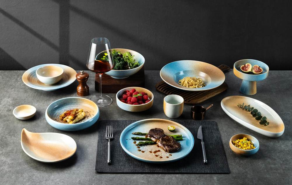
Like, they use ceramic tableware colors, and so the table looks better in photographs and Insta. It gives food a sense of depth that was initially lacking with flat, white sets.
Pairing a warm neutral plate with a slightly darker bowl or a contrasting charger gives another dimension to the food. It makes things look well thought out and planned.
These mixed and intentional palettes also increase the life of your dinnerware. Minor chips and glaze variations blend in better on earthy or jeweled-tones compared to white. Industry reports cite that the demand for mix-and-match tableware is rising, with an approximately 18% increase since 2024.
Top Three Dinnerware Color Trends 2026
Dinnerware color trends in hospitality are designed based on certain elements. They are selected by keeping in view the space and how the businesses operate every day.
Eyeing closely, you’ll see there are actually three broad categories of custom dinnerware colors that dominate the hospitality dinnerware design in 2026.
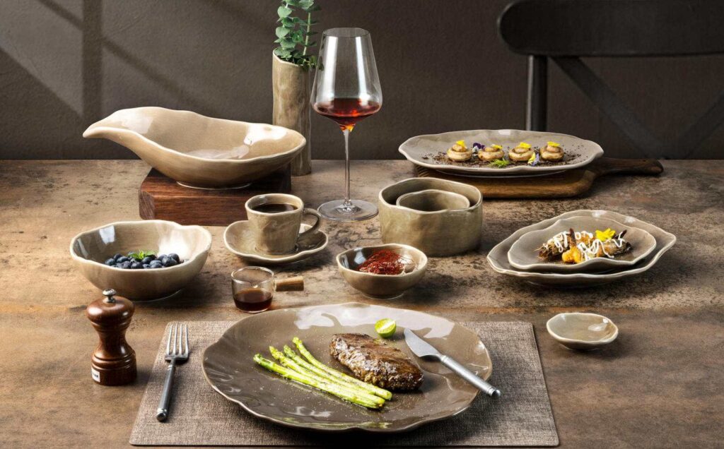
Earthy Neutrals
First off, you’ll see earthy-toned dinner plates as the top dinnerware color trend for 2026. There are different tones like clay, warm sand, terracotta, limestone, mushroom gray, and the like.
These are loved because they solve a number of problems for event managers:
- Grounding: These tones do not compete with the main serving. Rather, they make them look rich and intentional.
- Hide Chips and Scratches:The earthy tones are very good at hiding minor scratches and chips (where white can be the least forgiving).
- Consistency:When used in high-volume restaurants, earthy dinnerware looks consistent and lasts without needing replacement for years.
- Depth: When different glazes are used in a combo, it feels like the spread is handcrafted. It shouts premium quality.
- Authenticity: Earthy dinnerware goes with all boutique restaurants, hotels, farm-to-table restaurants, resorts, and a host of other venues. That’s because it looks authentic.
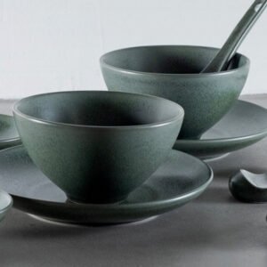
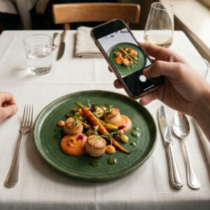
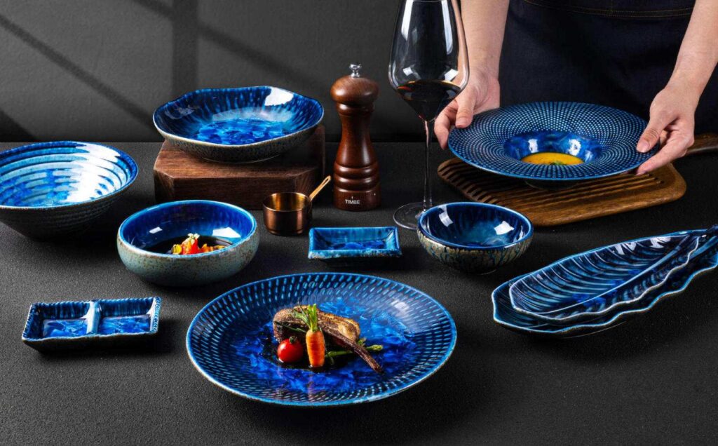
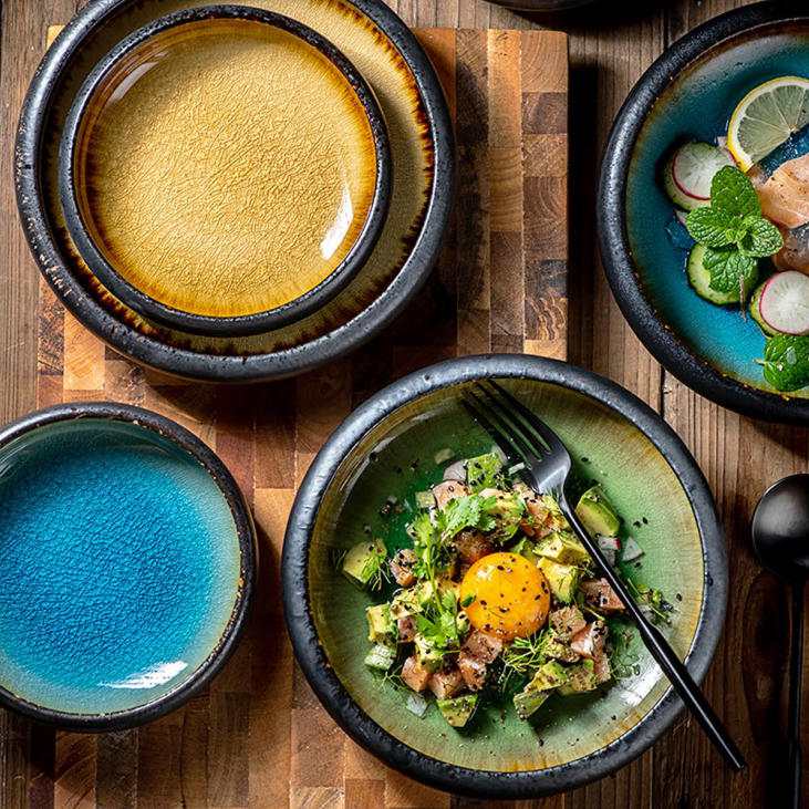
Deep Nature and Jewel Tones
Many spaces layer their serving dishes in olive, forest greens, basal black, and stormy blue hues.
But there’s a catch. Choosing the wrong shade or overly glossy finish can give off cheap vibes. The colors need to be aligned strategically.
Usually, the best option is to go with neutral base plates like cream or bone white colors. Then, combine them with a deep green bowl or salad plate. Playing with contrasts makes it less overwhelming, yet the courses stand out visually.
Jewel tones like emerald, deep navy, cobalt, burgundy, etc., too, are meticulously selected as intended accents.
Here’s why:
- Drama: Deep nature tones bring drama to the table. They subtly elevate the perceived value as they trigger strong emotions.
- Luxury Feel: When used in the right combos, these make the food and setting feel more luxurious and well planned.
- Trending:Since the pandemic, hospitality dinnerware design is no longer minimalistic. Today, it has personality and depth.
- Rich:If you do not want to invest further in elaborate decor, just use deep ceramic tableware colors. These alone can make the ambience feel rich and confident.
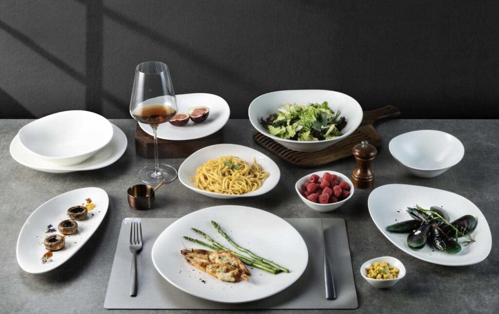
Soft Whites and Muted Washes
Since we are talking colors and hues, you might be thinking, “Is white really out of style this year?”
Short answer: No.
But it definitely has evolved. Instead of using stark white, we now have options like eggshell, cream, and bone white. There are also pastel and other softly washed tones like blush, sage, pale blue, ash rose, and terracotta.
Each piece makes the serving look appealing yet balanced.
- Neutral: These colors look neutral. They make the meal feel warm and intentional.
- Modern: The look gives off modern vibes.
- Photogenic: These tones also perform better on camera than white.
- Create a Difference: Muted washes and reactive glazes also make each serving look slightly different, which makes things visually interesting. It makes people feel that everything is consistent with the decor.
Ideal For: This type of color family is best for contemporary cafés, concepts, lifestyle hotels, and wellness spaces
Why Are These Color Trends Dominating 2026?
In 2026, you can’t let your dinnerware’s color work on its own. To stand out in the competition, you need to respond to the way your guests want. You have to keep up with the market and how other event venues are performing.
So, although dinnerware color is about appeal, behind these bold tones are the cultural shifts and psychological triggers.
Let’s take a look at the ‘way’ behind these dominating color families. Let’s learn why they are leading the markets in 2026.
Earthy and Natural Colors
Natural energy, like warm sand, terracotta, and soft caramel, indicates authenticity and connection to nature. Today, diners expect sustainability as a core value.
It’s no longer an option or add-on. So when you use modern ceramic colors in these hues, the ambience feels grounded and effortless. Immediately, it also gives a sense of environmental consciousness.
So before the guests even take a look at the menu, they get the story behind the concept.
The Post-Minimalism Shift
The last five, in fact, the last 10 years were all about minimalistic white plates. But today, people feel comfortable in places that are warmer and less corporate.
So the cold whites are often replaced by neutrals and warm layouts.
It’s something we call ‘soft minimalism.’ On the one hand, it keeps simplicity intact, but on the other, it swaps away the clinical white for warmer tones.
The Social Media Effect
Life today is all about social media. Insta, Facebook, YouTube, TikTok, all have rewired the way we did things before (including dinnerware).
Although white looks aesthetically astounding and goes with any dish, it is often replaced by bold accents. Rich greens and jewel-tones get photographed and look beautiful when shared.
The color pops out in the photos, and that often speaks about the brand and venue itself.
Talk about a free promotion!
The venues that use richer and more expressive dinnerware often notice more social mentions and virtual guest engagement. Standing out often also leads to more shares, higher foot traffic, and bookings.
However, as emphasized before, always do it thoughtfully. Leaning too much on the dramatic hues for photos can backfire. This is especially true if the dish colors clash with the food.
Then the table decor also matters. If you have neutrals on the table linen, you can use bolder tones; otherwise, it’s better to stick to the earthy ones.
Color Psychology in Dining
Color psychology actually has a measurable effect on the guest behavior. Using colors brings out an emotional response and satisfaction. Even in dining, warm hues can make people feel present and relaxed. Deeper colors often reflect luxury and go with specific occasions.
When you choose colored dinnerware thoughtfully, you can make the space look more inviting and warm. The guests will want to stay longer at such a place. That means you get higher coverage and spending!
Then, colors like warm earth tones and greens also make the dishes look more premium and satisfying. That translates to: higher ratings!
How to Choose the Right Dinnerware Color for Your Venue?
Since everything has to be thought out, you need to think about a dinnerware strategy. Match your palette to your venue type and concept. Let’s take a look.
Your Venue Concept
The first thing to think of is what kind of venue are you? Is it a fine dining place or a casual café? Are you a boutique hotel or a multi-event catering operation?
The color you choose for your plates should amplify the effect you want to have on your guests. Like, say you want the guests to get a feel of premium luxury when they’re walking in.
Jewel-toned dinnerware or warm taupes are better in this case.
If you are serving at a wellness-focused resort, earthtones with subtle glaze variations give a feeling of calmness and closeness to nature.
Guest Demographic
Next, you need to think about who your guests are. Think about their age, income, occupation, values, and occasion type.
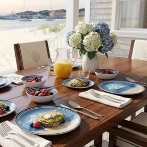
Like, if you are serving Millennials and Gen Z, they’d love bold and pastel shades. But if you also serve the boomer population, they might see these colors as cheap or trendy and won’t relate to them.
When serving in coastal markets, you need a cooler and lighter palette. Then there are occasions like weddings. There, you can use jewel tones.
Operational Realities
Durability is very important. If you use darker tones, you may be able to conceal the stains, but chips and other imperfections will show up profoundly.
So white is always a go-to option as it’s easy to replace and forgiving. But you can use pastel and beige, too, as they give a warmer feel
Other things to consider include:
Will you be using the dishwasher?
How well-trained is your staff in handling the dishes?
Then there are logistics, too. All these factors are very important to consider.
Test the Market
With colored dinnerware, there’s always a chance that things could go wrong. So, before you roll out the full set, better order a sample first in 2 to 3 color variations. Test them in real service.
Put them through the dishwashers and observe the way your staff handles them. You can also photograph the plates under restaurant lighting and see how they turn out.
Ask the guests for feedback through comment cards or casual conversation. This will give you real insight into whether you should use the color or stick to the neutrals.
Plan for the Future
A very important thing to note here is that if you need to re-order this color 2 to 3 years later, you might find a slightly different shade.
So often partnering with the manufacturer who archives the color formula (like Brett) can get you consistency. But at times, you will have to mix and match or change the entire set in case replacement is an issue over the long term.
Venue Type | Top Recommendation | Option 2 | Why It Works | Presentation |
Fine Dining / Luxury Hotels | Deep jewel tones, grays, or taupes | Ivory or cream base plates with jewel-tone accents | Exhibits luxury | Use a navy dinner plate + ivory salad plate + gold-accented serving ware. |
Casual Dining | Earthy tones with matte or satin glazes | Classic bright white | Look inviting and hide wear. Best for fast service. | Use warm sand plates with wood boards and linen. |
Boutique and Experiential Venues (Weddings, Private Events) | Jewel tones or soft pastels per the event theme | Curated mix-and-match collections | Sets the event mood | You can use sage for garden weddings, navy for formal dinners, or blush for engagements/personal events. |
Wellness and Health-Focused Concepts | Earthy tones with reactive or hand-applied glazes | Option 1 works best! | Looks organic, calm, and artisanal | Pair reactive matte sage plates with neutral linens |
Catering / Multi-Use Venues | Neutral palettes like cream, warm white, soft gray | Neutrals in varied finishes | Maximizes versatility in corporate, casual, and formal events | Use warm white or soft gray plates in mixed matte and gloss finishes, paired with neutral chargers |
Stoneware, Porcelain, Or Bone China?
You may choose the best color, but another key consideration is the kind of material to go for. The top options are stoneware, porcelain, and bone china.
Stoneware is heavy and durable. So, it is highly recommended for high-volume casual dining.
Then porcelain is smoother and slightly more translucent. It also works great with fine dining and plated presentations.
Bone china is very elegant and lightweight. It is used in luxury hotels and high-value events. But it is breakable, so logistics and handling have to be thought out.
Conclusion
The dinnerware color trends 2026 are not about adding a finishing touch to your decor. It is a slogan. It talks about your brand story and communicates with the guest way before food arrives.
Every hue or color you put on the table conveys calm, luxury, celebratory, or healthy.
So check out the extensive range of colors and patterns at Brett, where quality always comes first. Make your brand dazzle with the dinnerware that lasts.